Stunning Graphic Design
That Delivers Results.
We create high-impact leaflets, brochures, and marketing materials that capture attention and grow your business.







Our Services
Everything you need for exceptional branding
We provide a complete suite of design services to build your brand and engage your audience, from initial concepts to print-ready files.
-
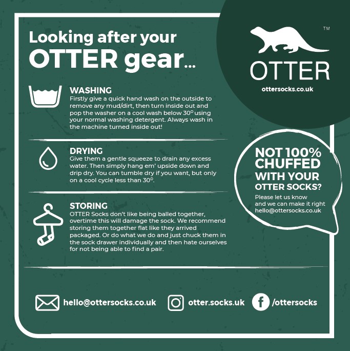
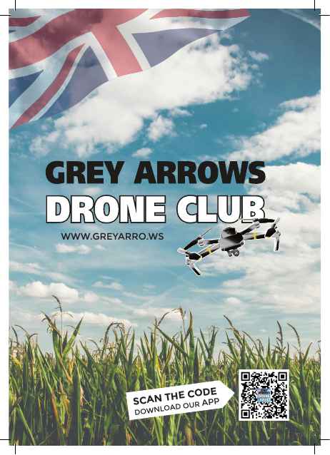
Leaflet & Flyer Design

- High-impact, custom designs perfect for promotions, events, and marketing campaigns that capture attention instantly.
-
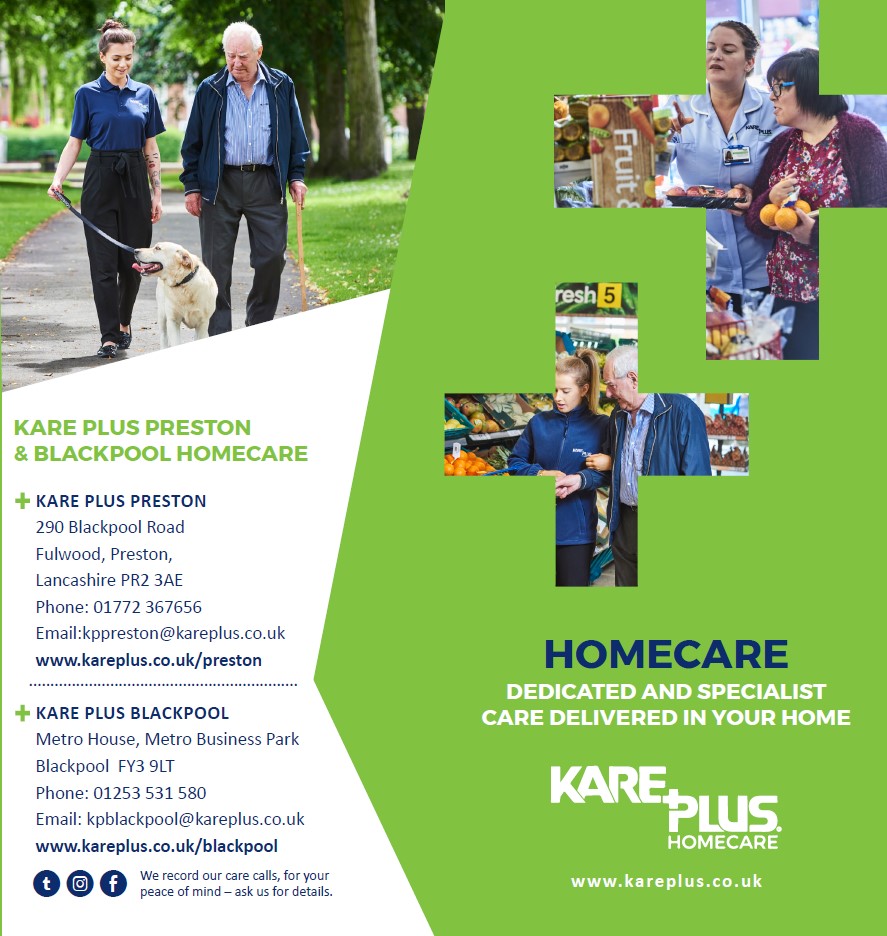
Brochure & Catalogue Design
- Tell your brand's story with beautifully crafted brochures and catalogues that showcase your products and services in detail.
-
Full Branding Packages

- From logos and colour palettes to complete style guides, we build cohesive and memorable brand identities from the ground up.
-
Print-Ready Files
- All our designs are delivered as high-resolution, print-ready files, ensuring a flawless final product every time.
3940+ Happy Landingfolio Users
Don't just take our words

"Really great job on the logo and the staionery for our business. Done in a timely manner and exactly what I wanted."
EPCs SOUTHWEST

“Lorem ipsum dolor sit amet, consectetur adipiscing elit, sed do eiusmod tempor incididunt ut labore et dolore magna aliqua. Ut enim ad minim veniam, quis nostrud aliquip”
James Washington
Let's Create Something Amazing.
Ready to start your next design project? Get in touch with us today.
Contact Us