

On average according to Quantify Research, you have around 3 seconds to attract the attention of your audience. Your audience should then take around 30 seconds to read your poster. If it takes longer than that to read your poster then you are probably not getting the message across.
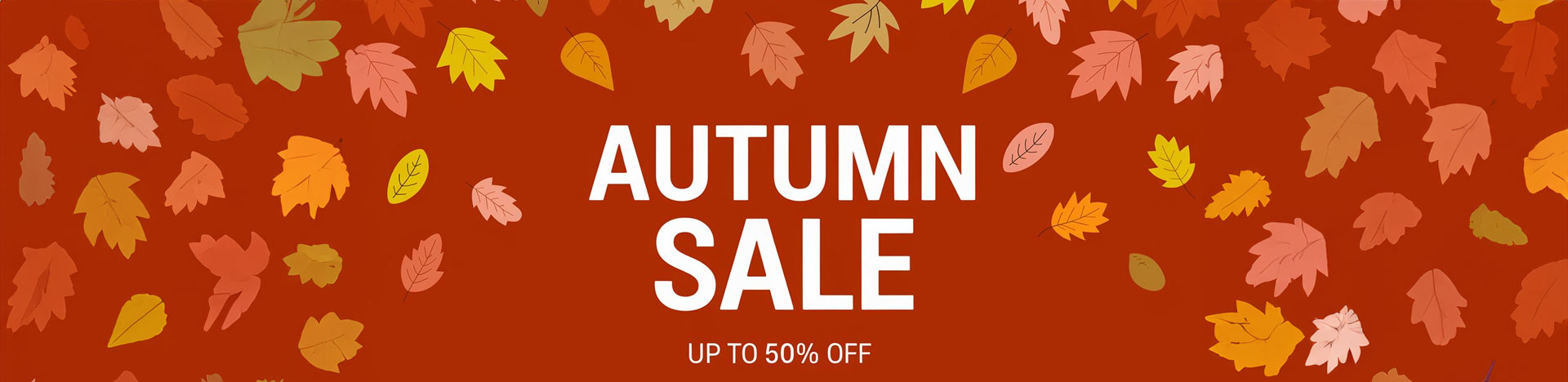
The old saying goes that less is more and reality is that this is very much the case with posters. The primary role of the poster is to promote and event, give details etc and as us humans are continually on the go, we don’t have the time to stop and stare, reading every line.
Step one
Use the top third of the poster for your key message. This is the area that the eye is more likely to be drawn to.
Step two
Try to keep the text down to a minimum. This might sound strange but with only 3 seconds to catch someone’s attention, you now only have 30 seconds to get all this information across and ideally you have to hit that in a few seconds.
Make sure the text is legible, clear, to the point and sentences are no more than 9 words long.
Step three
Divide the page into three sections. If portrait, get the message/band name in the top third, the middle is for imagery and impactive visuals to capture the audience and the bottom third is th call to action. Keeping a rough formula like this will ensure that the eye can follow where to look and get enough information. If the audience is a key demographic, they will spend the time to look longer, but ensure the date, time contact details are in sync with the rest of the poster.
Step four
Call to action is the most vital part of the poster. This is the area that has the date, time, phone number, contact details or location. Get the most important part to stand out the most, for example, if it is a concert, the date (along with the band logo) is the most important part that will be drawn to. If you have a collection of dates for a tour, make the city/town stand out in capital letters along with the date. Don’t take up real estate with times etc, that is something the audience will look for nearer the time. Websites, locations etc all make part of it and make them stand out with a different colour or if they you are following a suite of colours, make sure they are bold and are evenly spaced.
Choose mint graphics to design and print your posters using this tried and tested format.


")

")
")


")


")